Code
import requests
import pandas as pd
import plotnine as pn
import re
import numpy as np
import warnings
from plotnine.exceptions import PlotnineWarning
warnings.filterwarnings('ignore', category=PlotnineWarning)

rng = np.random.default_rng(42)Each 10 μg/m3 of PM2.5 air pollution is associated with an 8% increase in risk of mortality.1 For context, the average PM2.5 in inner London was 8.5 μg/m3 in 2024.2 This is a substantial improvement compared to 2016 when the average was 12.1 μg/m3, however it’s still somewhat above the WHO limit of 5 μg/m3.3 It’s also increasingly recognised that cleaner air can benefit health by reducing transmission of airbone pathogens.4
One way to reduce your exposure to pollution is to use an air purifier inside your home. But how can you evaluate the effectiveness of a personal air purifier?
Air purifier performance is typically quantified using CADR: Clean Air Delivery Rate. What is this exactly and how can you use it to calculate the theoretically expected reduction in pollution, and therefore health benefit?
Firstly let’s look at what exactly CADR is, how it is measured, and its potential limitations.
CADR is the rate at which air is cleaned, measured in cubic feet per minute (CFM) or cubic meters per hour (m3/h).
CADR can be measured according to the ANSI/AHAM AC-1-2020 standard.5,6 In this procedure a climate controlled test chamber of 1008 ft3 (28.3 m3) is filled with one of the three pollutants: smoke, dust, or pollen. These pollutants have different size ranges: 0.09 to 1.0 μm for smoke, 0.5 to 3.0 μm for dust, and 0.5 to 11.0 μm for pollen. There is a ceiling fan for initial mixing of the pollutant and a wall recirculation fan to circulate the air during the test. There is no ventilation (< 0.03 air changes per hour) nor further addition of pollutant. The air purifier is placed in the center of the chamber and turned on to maximum and the decay of pollutant is measured. The decay in that case is due to both the air purifier and natural decay e.g. due to deposition on surfaces. So to calculate the decay only due to the purifier the experiment is repeated without the air purifier to measure the natural decay (due to deposition), which can then be subtracted from the total decay. The outcome of such an experiment might look something like this for an air purifier with a CADR of 300 CFM:
import requests
import pandas as pd
import plotnine as pn
import re
import numpy as np
import warnings
from plotnine.exceptions import PlotnineWarning
warnings.filterwarnings('ignore', category=PlotnineWarning)
rng = np.random.default_rng(42)def decay_fn(t, l=1/600):
return np.exp(-t * l)
def simulate_CADR_test(ke=0.3 + 0.005, kn=0.005, tmax=20):
# first compute theoretical lines
decay = []
for state, decay_rate in {'Purifier_on': ke, 'Purifier_off': kn}.items():
tmp = pd.DataFrame({'time': np.linspace(0, tmax, 101),
'concentration': decay_fn(np.linspace(0, tmax ,101), decay_rate),
'Experiment': state})
decay.append(tmp)
decay = pd.concat(decay)
# now add fake data points
decay['measurement'] = np.nan
decay.loc[decay.time % 1 == 0, 'measurement'] = decay.loc[decay.time % 1 == 0, 'concentration'] + rng.normal(scale=0.02, size=tmax*2 + 2)
decay.loc[decay.measurement>1, 'measurement'] = 1
decay.loc[decay.measurement<0, 'measurement'] = 0
return decay
def plot_CADR_test(decay):
p = pn.ggplot(decay, pn.aes('time','concentration', colour='Experiment')) +\
pn.geom_line() + \
pn.geom_point(pn.aes(x='time', y='measurement'), colour='black') +\
pn.theme_light() + \
pn.theme(legend_position='bottom') +\
pn.scale_colour_brewer(type='qual', palette='Set1') +\
pn.xlab('Time (minutes)') +\
pn.ylab('Relative pollution level')
return(p)
smoke_test_data = simulate_CADR_test()
plot_CADR_test(smoke_test_data)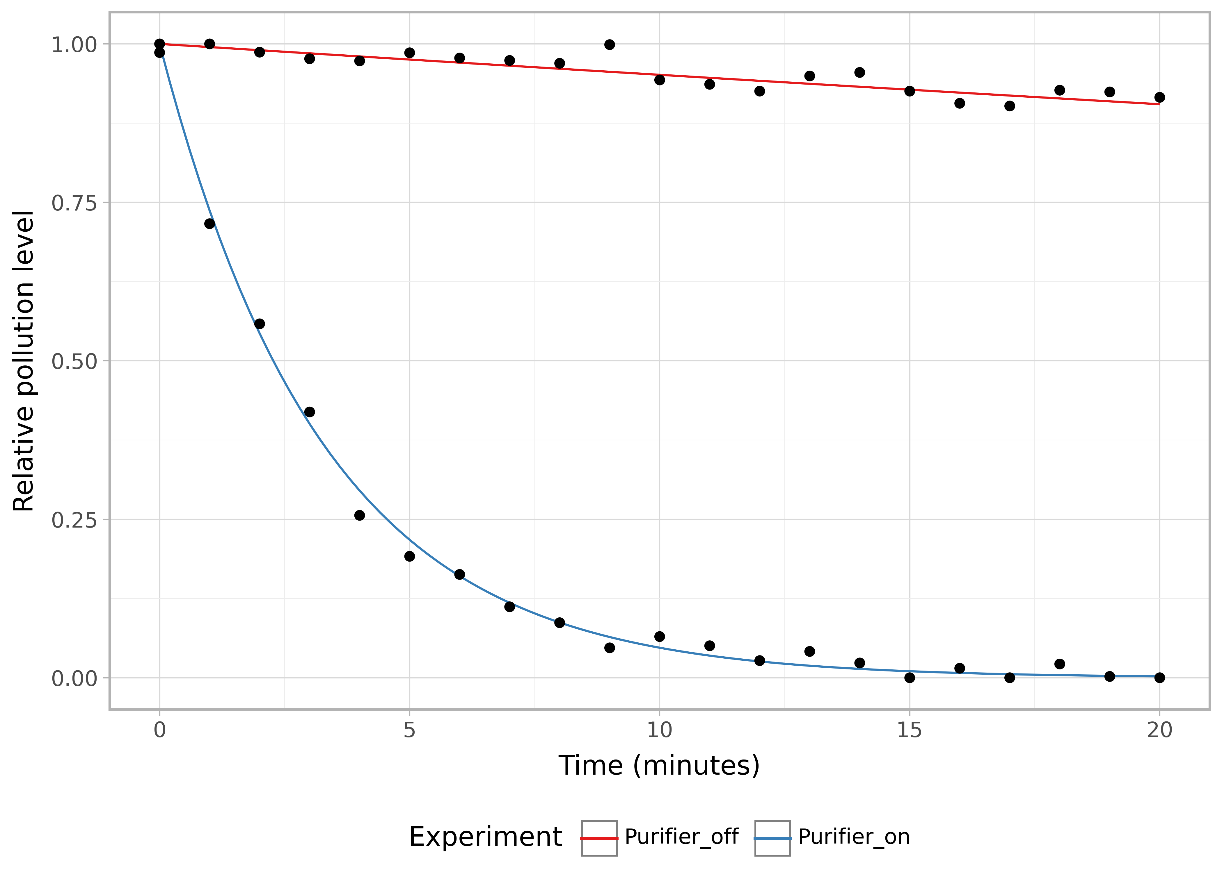
Each of these curves has a decay constant, and the CADR is then calculated as:
\[ CADR = V * (k_p - k_n) \]
where
For pollen, because the particles are larger, the natural decay is faster (for comparison the above smoke curves are shown as grey dashed lines):
pollen_test_data = simulate_CADR_test(ke=0.3 + 0.1, kn=0.1, tmax=10)
plot_CADR_test(pollen_test_data) + \
    pn.geom_line(data=smoke_test_data,
                 colour='grey',
                 mapping=pn.aes(group="Experiment"),
                 linetype='dashed') +\
    pn.xlim(0,11)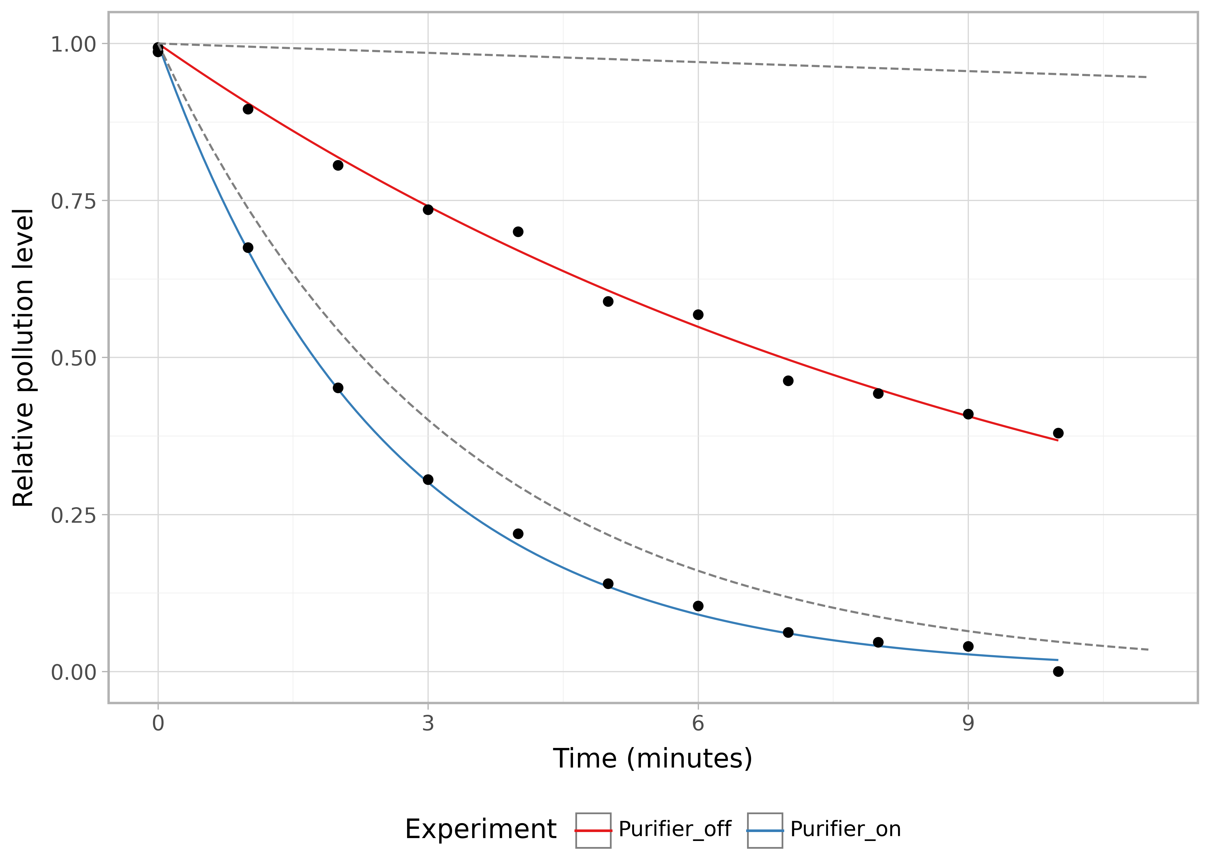
The standard specifies taking readings at one minute intervals (apparently the measuring device has a 20 second sampling period). Note that the experiment length is only 10 minutes for pollen vs 20 minutes for smoke and dust. At least 5 readings above minimum detectable levels required for pollen and at least 9 for smoke and dust.
The difference is due to the faster natural decay of pollen due to its larger size, and is presumably why under this standard the maximum CADR of pollen (450 CFM) is lower than that for smoke (600 CFM).
There are criticisms of this test, for example from Dyson, who note that the performance of a purifier placed in the center of a small room with a recirculation fan likely overstates performance compared to the real world where typical rooms are much larger, don’t have recirculation fans, and the purifier is likely to be placed in the corner.
Another criticism is that the purifier is measured on the maximum level, but this setting won’t typically be used because it’s too loud. We shouldn’t try to maximise air quality at the expense of overall environmental quality - including noise pollution. Some independent testers instead also measure the purifier at the level which produces <37dB of noise.
AHAM has a database of the CADR rating for 536 air purifiers on their website ahamdir.com. We can use this to get an idea of what the typical performance is:
r = requests.get("https://gbs.trutesta.io/trutesta-proxy-services/proxies/aham/models",
                 params={'marketCode':'US',
                         'pageSize':'1000'})
dt = pd.DataFrame(r.json()['searchResults'])

dt_unique = dt[['smoke','pollen','dust','brandUuid']].drop_duplicates()median_cadr = dt_unique.smoke.median()
p = pn.ggplot(dt_unique, pn.aes('smoke')) + \
pn.geom_histogram(binwidth=10) + \
pn.geom_vline(xintercept=median_cadr, colour='blue', linetype='dashed') +\
pn.annotate('text', label=f'Median: {round(median_cadr)}', y=15, x=225) +\
pn.theme_light() +\
pn.xlab("Smoke CADR (cfm)") +\
pn.ggtitle("Distribution of air purifier performance in the AHAM database.") +\
pn.labs(caption="Source: ahamdir.com, March 2024")
p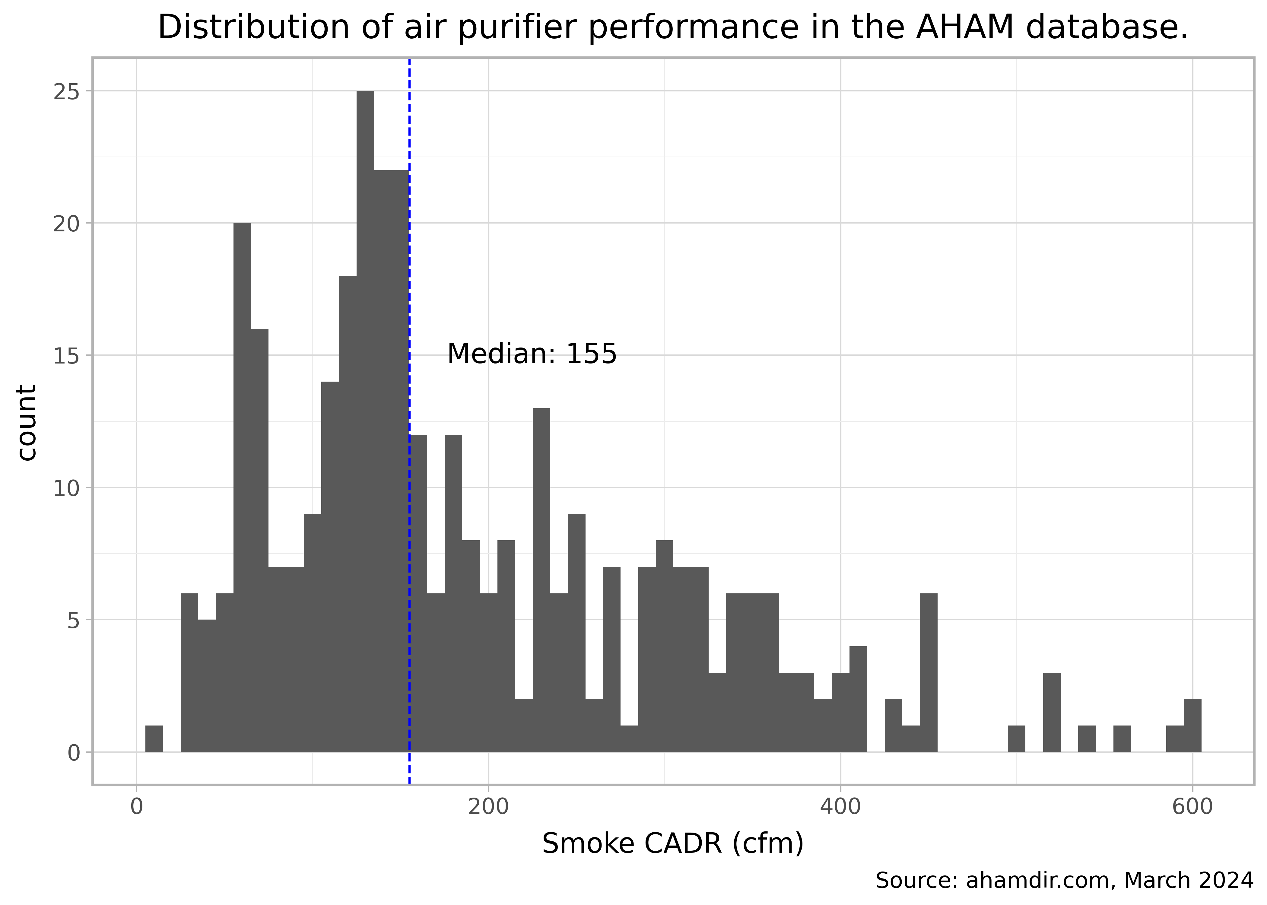
This plot is for smoke - how does this compare to dust and pollen?
The smoke and dust CADR are very similar, with the dust CADR being a tiny bit higher on average as shown by the blue regression line compared to the black line which is \(y=x\). (I removed values at exactly 400 CADR for dust to fit the regression line as this was the previous maximum CADR value for dust, but has now been updated to 600.)
p = pn.ggplot(dt_unique, pn.aes('smoke', 'dust')) + \
    pn.geom_point(alpha=0.25) + \
    pn.xlab('Smoke CADR (cfm)') + \
    pn.ylab("Dust CADR (cfm)") + \
    pn.geom_abline(intercept=0, slope=1) + \
    pn.geom_smooth(data=dt.query('dust!=400'), colour='blue', linetype='dashed', method='lm') +\
    pn.theme_light() +\
    pn.labs(caption='black line: y=x, blue dashed line: OLS regression. data source: ahamdir.com')
display(p)

pollen_smoke_diff = dt_unique.query('pollen!=450').pollen.mean() - dt_unique.query('pollen!=450').smoke.mean()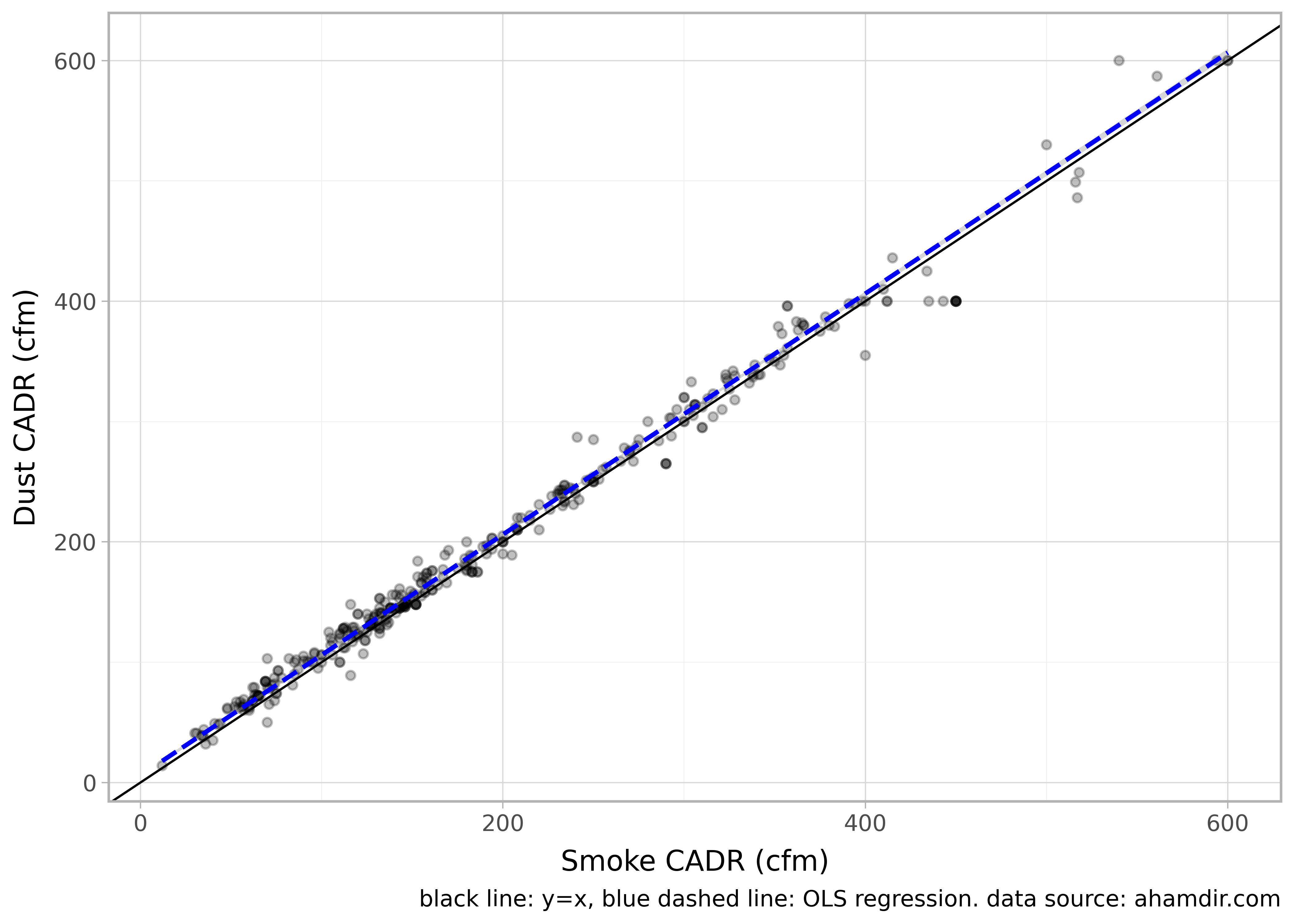
The pollen CADR is on average 20 units higher than the smoke CADR but otherwise scales pretty linearly.
You can also see clearly on this plot that the maximum pollen CADR achievable by this standard is 450 (but 600 for smoke and dust).
p = pn.ggplot(dt_unique, pn.aes('smoke', 'pollen')) + \
    pn.geom_point(alpha=0.25) + \
    pn.xlab('Smoke CADR (cfm)') + \
    pn.ylab("Pollen CADR (cfm)") + \
    pn.geom_abline(intercept=0, slope=1) + \
    pn.geom_smooth(data=dt.query('pollen!=450'), colour='blue', linetype='dashed', method='lm') +\
    pn.theme_light() +\
    pn.labs(caption='black line: y=x, blue dashed line: OLS regression. data source: ahamdir.com')
p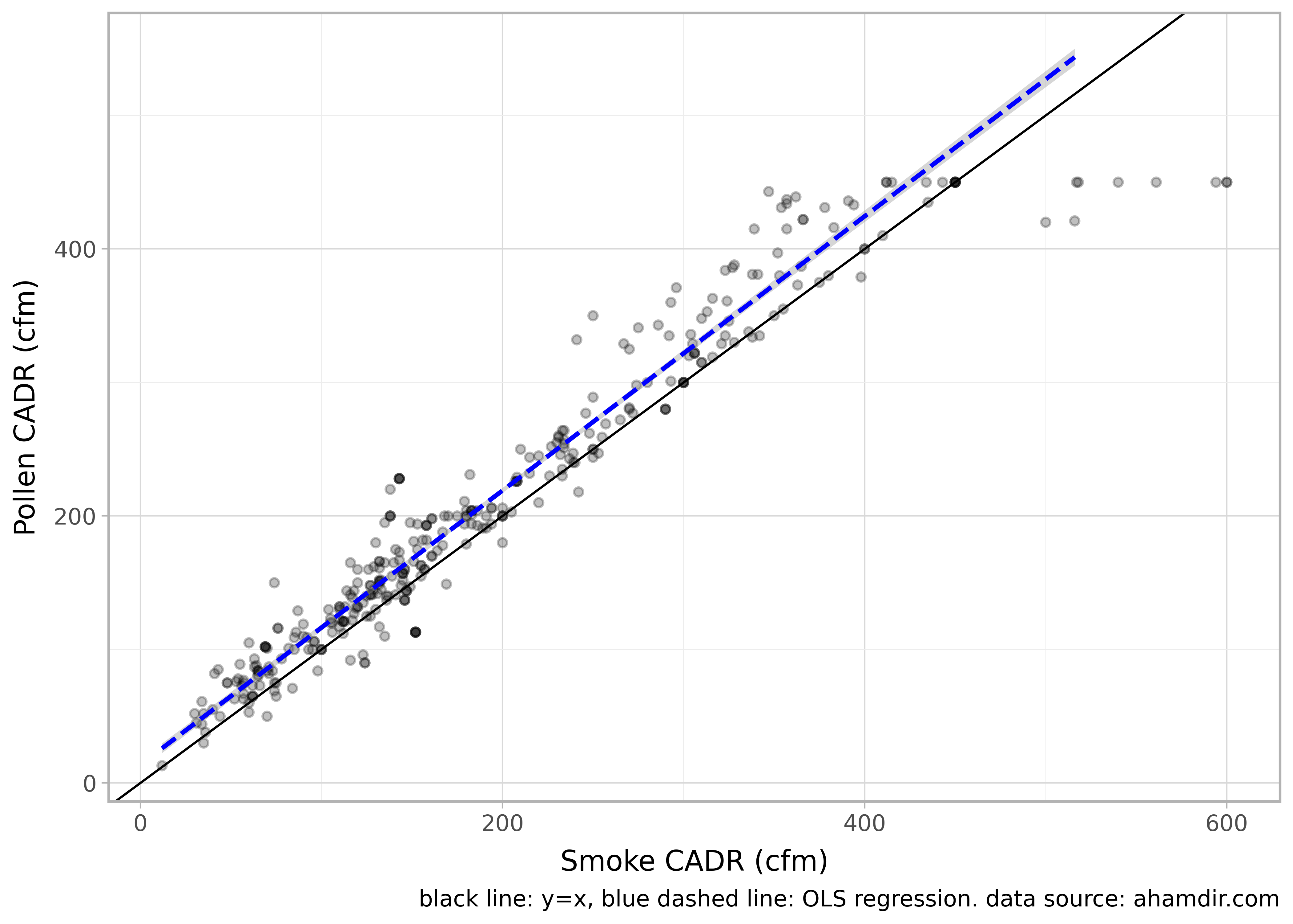
What’s the relationship between CADR and relative levels of pollution over time?
The CADR divided by the volume of the room will give the ACH (Air Changes per Hour). However, 1 ACH as defined by that simple division does not mean that all of the air will be purified after 1 hour. This is because the purified air is constantly mixing with the unpurified air so some of the air ends up going through the device multiple times (“short circuiting”).
To calculate the relative purification over time whilst accounting for this we can use the room purge equation.
\[ \frac{C_t}{C_0} = e^{- \lambda t /\kappa} \]
where
For the plots below I’ve used a mixing factor of 1.5 to account for imperfect (non-instantaneous) mixing of the air.
def percent_format2(x):
    labels = [f"{v*100}%" for v in x]
    pattern = re.compile(r'\.0+%$') #
    labels = [pattern.sub('%', val) for val in labels]
    return labels

def concentration(t, ach=2, k=1.5):
    """
    t: time in hours
    ach: Air Changes per Hour
    k: mixing factor (2 meaning 50% mixing)
    Assumes perfect mixing and no continous addition/release of particles
    """
    return np.exp(-1 * t * ach * 1/k)

decay = []
for ach in [1,2,3,4,5,6]:
    tmp = pd.DataFrame({'time': np.linspace(0,2.2,100) * 60,
                        'particles': concentration(np.linspace(0,2.2,100), ach),
                        'ACH': ach})
    decay.append(tmp)

decay = pd.concat(decay)

p = pn.ggplot(decay, pn.aes('time', 'particles', colour='ACH', group='ACH')) +\
        pn.ylab('Particles remaining') +\
        pn.xlab('Time (Minutes)') +\
        pn.geom_line() +\
        pn.coord_cartesian(xlim=[0,120]) +\
        pn.scale_x_continuous(breaks=15 * np.arange(0,9,1)) +\
        pn.scale_color_gradient2(low='black', mid='#feb24c', high='#f03b20', midpoint=3.5) +\
        pn.theme_light()

display(p + pn.scale_y_continuous(labels=percent_format2))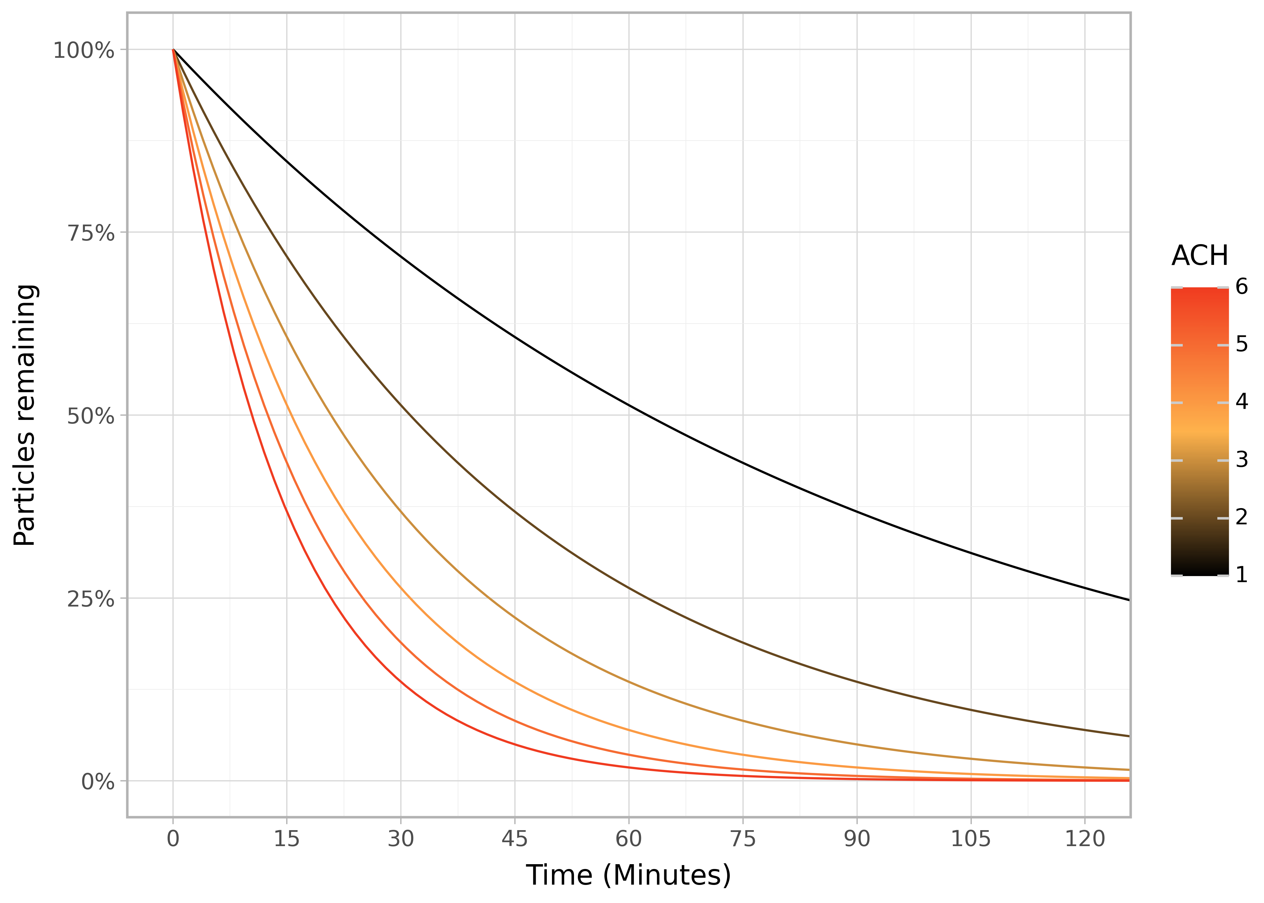
and on a log scale:
display(p + pn.scale_y_log10(labels=percent_format2))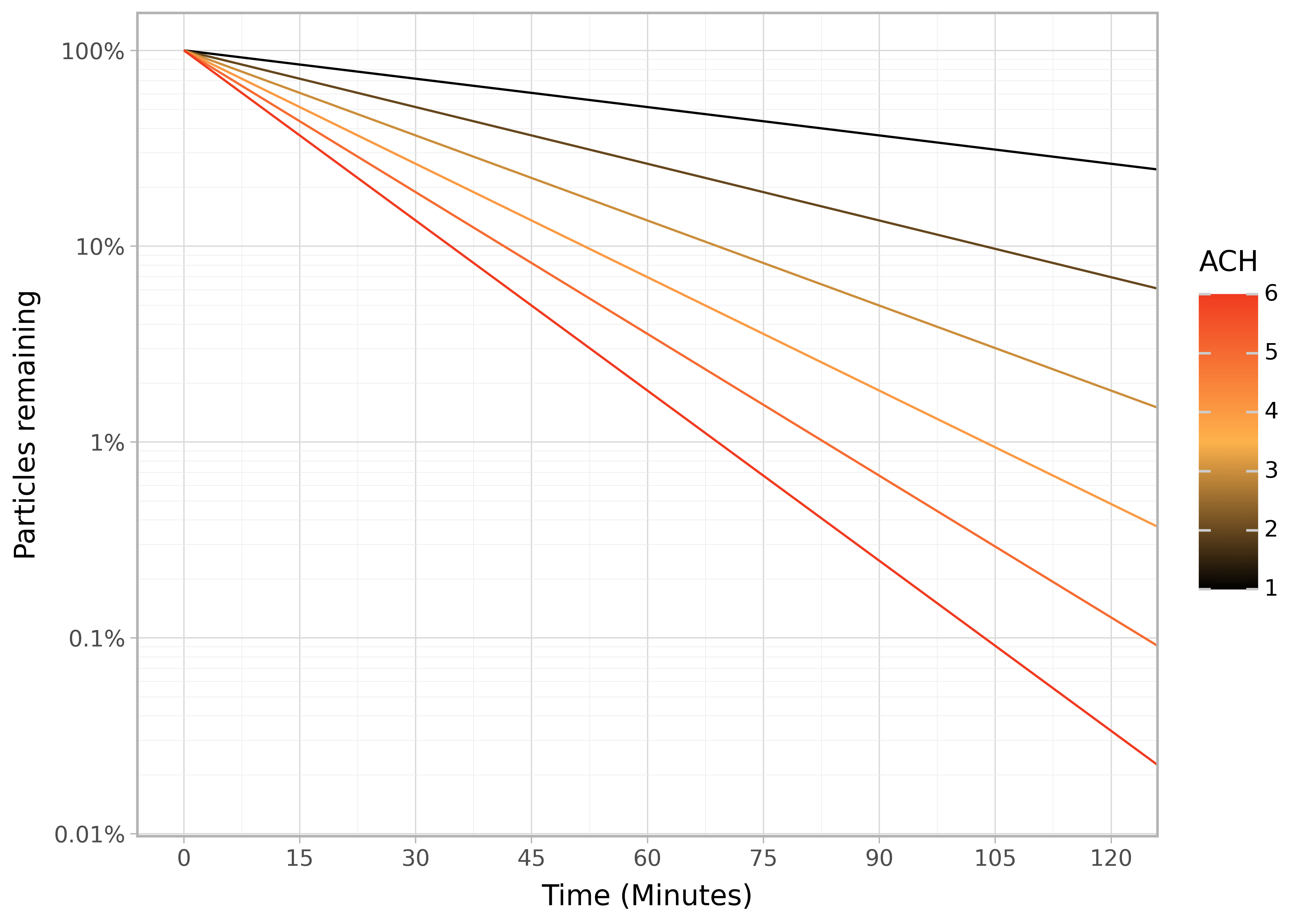
However this equation is a simplification that, for example, assumes no additional pollutant is being added.
Where does this equation come from?
We can define a mass balance equation7:
\[ \frac{dC_t}{dt} = \frac{S}{V} + \lambda_v (PC_{\text{amb}} - C_t) - (\lambda_p + \lambda_d) C_t \]
where
The first term represents processes that introduce pollution from inside the room. The second term represents air exchange between outside and inside the room, with the difference between the concentrations being the net change per unit of air exchanged. This could be a pollution increasing or decreasing process, depending on whether the outside air is cleaner than inside or vice versa. The third term represents processes that remove pollution, either by active purification or by deposition.
Now we can start to see where the basic room purge equation comes from. If we assume the processes no additional pollutant is added after time 0, and also use a single lambda term for all removal processes we get:
\[ \frac{dC_t}{dt} = -\lambda C_t \]
and solving this
\[ {C_t} = C_0 e^{-\lambda t} \]
In reality we don’t live in sterile sealed boxes, there’s probably some pollution coming in from outside or being generated from inside the room. Over the rate of pollution being added will reach an equilibrium with the removal due to purification. It’s the relative reduction of this equilibrium level with and without an air purifier that we care about, and it’s on that basis that a recommended room size can be calculated.
AHAM recommend the maximum room area to be 1.55 times the CADR rating, based on 4.8 ACH. They calculate this would reduce the steady state pollution levels by 80%. For example, an air purifier with smoke CADR of 137 can purify a room up to 212 ft2. How do they arrive at this number?
They assume a scenario where the pollution source is inside the room and outside air is clean and so ventilation is a pollution removing process.
Steady state / equilibrium is achieved when \[\frac{dC_i}{dt} = 0\]
In a scenario without air purification this would be: \[ \begin{split} \frac{dC_t}{dt} &= \frac{S}{V} + P C_{amb}\lambda_v - (\lambda_v + \lambda_d) C_t \\ 0 &= \frac{S}{V} + P C_{amb}\lambda_v - (\lambda_v + \lambda_d) C_t \\ \frac{S}{V} + P C_{amb}\lambda_v &= (\lambda_v + \lambda_d) C_t \end{split} \]
We want to compare this to a scenario where the air purifier is present and pollution levels are 20% of what they are above: \[ \frac{S}{V} + P C_{amb}\lambda_v = (\lambda_p + \lambda_v + \lambda_d) 0.2 C_t \]
Or, in general, using \(R\) to represent the relative pollution level:
\[ \frac{S}{V} + P C_{amb}\lambda_v = (\lambda_p + \lambda_v + \lambda_d) R C_t \]
The sources, ventilation rate, and deposition rates are the same in each scenario so:
\[ \begin{split} (\lambda_v + \lambda_d) C_t &= (\lambda_p + \lambda_v + \lambda_d) R C_t \\ (\lambda_v + \lambda_d) &= (\lambda_p + \lambda_v + \lambda_d) R \\ (\lambda_v + \lambda_d) &= \lambda_p R + (\lambda_v + \lambda_d) R \\ R \lambda_p &= (\lambda_v + \lambda_d) - R (\lambda_v + \lambda_d) \\ \lambda_p &= \frac{(1 - R)}{R} (\lambda_v + \lambda_d) \\ \end{split} \]
Using this formula with \(R = 0.2\), \(\lambda_v = 1\), and \(\lambda_d = 0.204\) (the values used in Annex E of the AHAM AC-1 standard) we get:
\[ \begin{split} \lambda_p &= \frac{(1 - 0.2)}{0.2} (1 + 0.204) \\ \lambda_p &= 4 * 1.204 = 4.816 \\ \end{split} \]
We recover the recommendation of 4.8 ACH.
In order to calculate the inverse, the relative pollution from a given ACH: \[ \begin{split} \lambda_p &= \frac{(1 - R)}{R} (\lambda_v + \lambda_d) \\ \frac{(1 - R)}{R} &= \frac{\lambda_p}{(\lambda_v + \lambda_d)}\\ R &= \frac{1}{\frac{\lambda_p}{(\lambda_v + \lambda_d)} + 1}\\ \end{split} \]
So if the purification rate \(\lambda_p\) is large compared to the combined effects of ventilation and deposition \((\lambda_v + \lambda_d)\) then the relative pollution is lower and vice versa.
Visually the relationship between desired steady state level of pollution vs ACH:
import numpy as np

def efficiency_ach(efficiency, lambda_d=0.204):
    return ((1-efficiency) / (efficiency)) * (1 + lambda_d)

p = pn.ggplot(pd.DataFrame(data={"x": np.linspace(0.05, 0.9, 100),
                        'red':'Pollen', 'black':'Smoke'}), pn.aes(x="x")) +\
    pn.geom_line(stat = "function", fun = efficiency_ach, mapping=pn.aes(colour='black')) +\
    pn.geom_line(stat = "function", fun = lambda x: efficiency_ach(x, 4), mapping=pn.aes(colour='red')) + \
    pn.theme_light() + \
    pn.theme(legend_position='bottom') +\
    pn.ylab('Air changes per hour due to air purifier') +\
    pn.xlab('Relative pollution level \nat steady state vs no purifier') +\
    pn.coord_flip(ylim=[0,20]) + \
    pn.scale_colour_brewer(type='qualitative', palette="Set1") +\
    pn.labs(colour='') +\
    pn.scale_x_continuous(labels=percent_format2, breaks=[0.05, 0.1, 0.2, 0.3, 0.4, 0.5, 0.6, 0.7, 0.8, 0.9]) +\
    pn.geom_vline(xintercept=0.2, linetype='dashed') + \
    pn.geom_hline(yintercept=4.816, linetype='dashed')

display(p)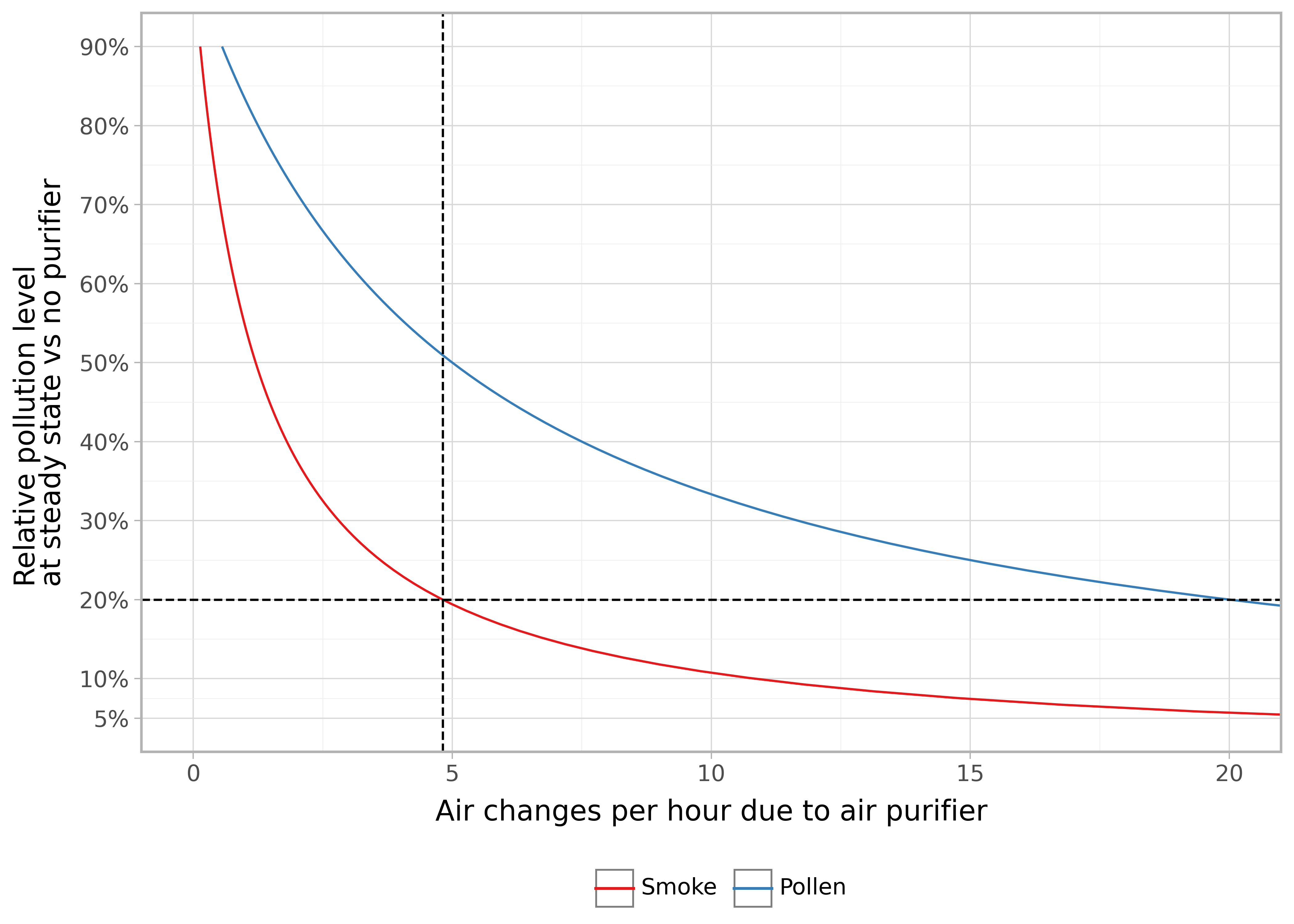
For smoke, to get from 20% steady state levels down to 10% requires a bit more than a doubling of ACH.
The CADR is \(\lambda_p V\) so \[ CADR = \lambda_p V = V \frac{(1 - R)}{R} (\lambda_v + \lambda_d) \\ \]
and assuming a room height of 8 feet the area is \(A = V / 8\) and \(V = 8A\)
\[ \begin{split} CADR &= 8A \lambda_p \\ &= 8A \frac{(1 - R)}{R} (\lambda_v + \lambda_d)\\ A &= CADR \frac{1}{\frac{(1 - R)}{R} 8 (\lambda_v + \lambda_d)} \\ A &= CADR \frac{R}{(1 - R)} \frac{1}{8 (\lambda_v + \lambda_d)} \end{split} \]
again plugging in \(R = 0.2\), \(\lambda_v = 1/60\) (now in minutes), and \(\lambda_d = 0.204/60\) we get
\[ \begin{split} A &= CADR \frac{0.2}{(1 - 0.2)} \frac{1}{8 (1/60 + 0.204/60)} \\ A &= 1.557 * CADR \end{split} \]
which was rounded down to 1.55 in the AHAM guidelines. So for example, a CADR of 160 CFM can purify a 250 ft2 (23 m2) room to 80% of steady state levels.
For this relative measure the type of pollution makes a much bigger difference compared to the CADR measures. \(\lambda_d\) for pollen is typically an order of magnitude bigger, say 4, so the conversion rate is 0.375 instead of 1.557. To achieve an 80% relative reduction in pollen for a 250 ft2 room requires a CADR of 666, which is already higher than the maximum measurable by the AHAM AC-1 standard.
If we know the area, and want to calculate the minimum CADR required to achieve 80% reduction of steady state levels: \[ \begin{split} CADR & = \frac{A}{1.557} \\ CADR &= 0.642 A \end{split} \]
This is the basis of the “2/3 rule” that CADR should be 2/3rd of the room’s area.
My air purifier has a smoke CADR of 250 CFM (425 m3/h), on maximum. My room size is 30 m2 with ceiling heights of 2.4 m so a volume of 72 m3. Using:
\[ \begin{split} R &= \frac{1}{\frac{\lambda_p}{(\lambda_v + \lambda_d)} + 1} \\ R &= \frac{1}{\frac{\text{CADR}/V}{(\lambda_v + \lambda_d)} + 1} \end{split} \]
I can expect a relative steady state pollution level of:
\[ \begin{split} R &= \frac{1}{\frac{425/72}{(1 + 0.204)} + 1}\\ &= 17\% \end{split} \]
Which is slightly below the 20% effectiveness guideline; as expected given that the recommended room size would be \(250 * 1.55 = 387.5\) ft2 which converts to 36 m2.
However I previously determined that the fan speed on the lowest setting is about 1/3 of the maximum setting. The airflow of a fan is directly proportional to its speed so perhaps the CADR is now only 1/3 * 425 and so the relative pollution levels remaining would instead be:
\[ \begin{split} R &= \frac{1}{\frac{425/(72*3)}{(1 + 0.204)} + 1}\\ &= 38\% \end{split} \]
I.e. more than double. Further, this is the value for smoke so pollen with its higher natural deposition rate would fare even worse. However, it may be that the natural ventilation is somewhat less than 1 ACH and perhaps the linear fan speed to airflow correspondence I assumed is not quite correct due to the barrier of the purifier’s filter. Both of which could result in an improved relative reduction.
The many factors that these simple models don’t account for and the uncertainties involved in the estimated constants means that they are really just rough guides to what one might expect in reality.
For example, while we’ve considered steady state levels, which means we can mostly ignore mixing factors, it takes time to reach steady state levels and life is not constant. Pollution may spike during cooking or cleaning, or opening the window, or during rush hour traffic - resetting the clock until steady state is achieved. Perhaps a large fraction of the time is not spent in steady state conditions. It could be that at steady state a gradient across a room is still present due to the location of the pollution and purifier. Further, the deposition rates and CADR likely vary with temperature and humidity. The filter performance will also degrade over time. Even the room volume we used is an approximation due to cupboards, appliances (e.g. fridge), and internal walls that reduce the effective internal volume.
We could start to quantify this uncertainty by specifying a distribution for each of the input variables and using those to generate a distribution of plausible values of the relative reduction:
n = 20_000

dists = {'CADR': rng.beta(35 * 0.95, 35*0.05, size=n) * (425 + 10),
         'Volume': rng.beta(35 * 0.95, 35*0.05, size=n) * 72,
         'lambda_v': rng.beta(20 * 0.2, 20*0.8, size=n) * (4),
         'lambda_d': rng.lognormal(mean=np.log(0.2), sigma=0.2, size=n)}


def R(cadr, V, lambda_d, lambda_v):
    cadr_v_ratio = cadr / V
    lambda_sum = lambda_d + lambda_v
    R = 1 / (1 + cadr_v_ratio / lambda_sum)
    return R

#print(R(425, 72, 0.2, 1))

dists['Relative_pollution'] = R(dists['CADR'], dists['Volume'], dists['lambda_d'], dists['lambda_v'])

dists = pd.DataFrame(dists).melt()
dists['variable'] = pd.Categorical(dists['variable'], ordered=True, categories=['CADR','Volume','lambda_d','lambda_v','Relative_pollution'])

pn.ggplot(dists, pn.aes('value')) + \
    pn.geom_density() + \
    pn.facet_wrap('~variable', scales='free') + \
    pn.theme_classic()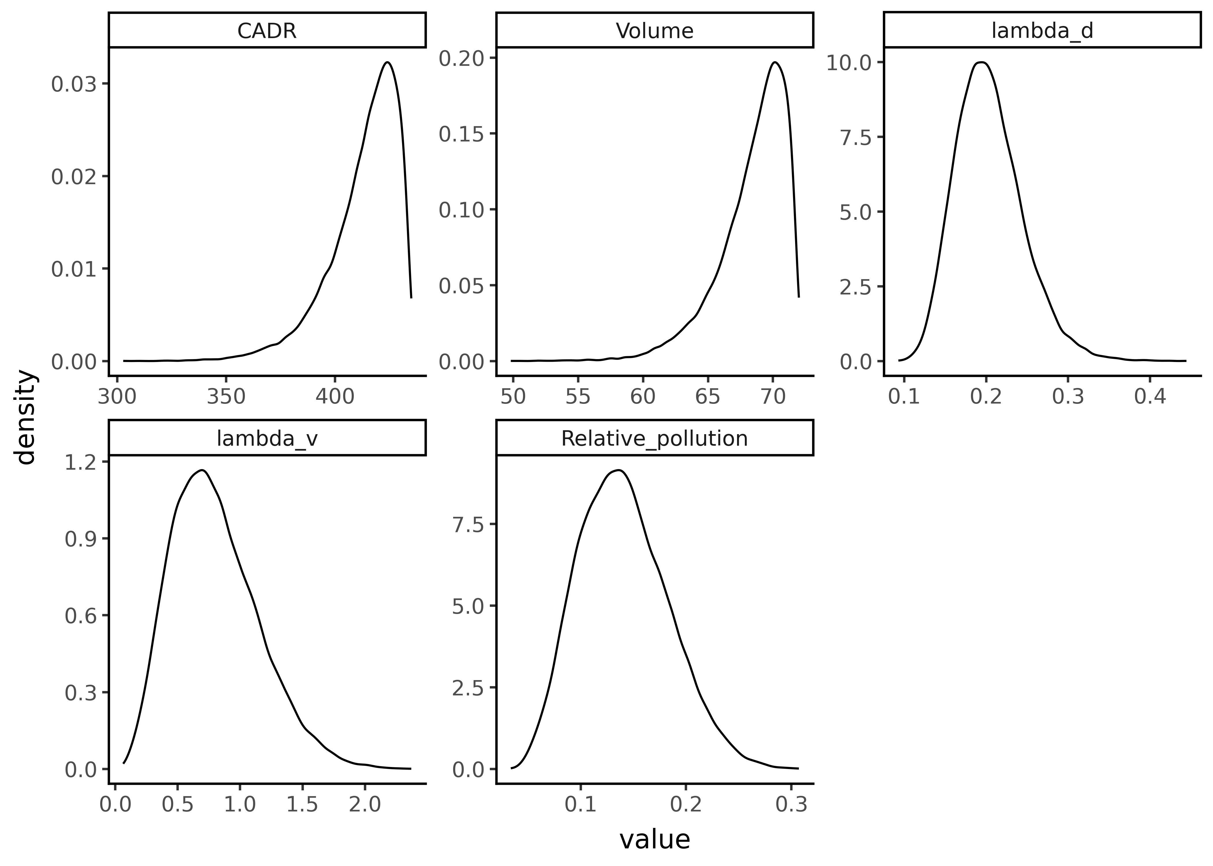
From this we can calculate a 95% credible interval of np.float64(0.07) - np.float64(0.23).
Ultimately, a cost benefit analysis needs to be made incorporating the cost of purchasing the purifier, the electricity to run it, replacing the filters, the additional floor space required, and increase in noise pollution, weighed up against the health benefits of breathing air with less pollution, pathogens, and pollen.
Long-term exposure to PM and all-cause and cause-specific mortality: A systematic review and meta-analysis 2020 doi://10.1016/j.envint.2020.105974↩︎
Air Quality in London 2016-2024 longon.gov.uk↩︎
Indoor airborne risk assessment in the context of SARS-CoV-2 who.int↩︎
Frequently Asked Questions about Testing of Portable Air Cleaners ahamverifide.org↩︎
What Is an Effective Portable Air Cleaning Device? A Review. doi: 10.1080/15459620600580129 alternative link↩︎